
Color & Meaning: Picking a Thangka Pendant by Hue (Mood, Focus, Rest)

Color is one of the fastest ways a piece of jewelry communicates intention. When you choose a Thangka pendant by hue, you’re not just picking a pretty object—you’re choosing a daily visual cue that can nudge mood, sharpen attention, or invite calm. This practical guide explains common color associations used in Tibetan iconography and contemporary jewelry. If you’re shopping for a Thangka pendant color meaning—or building a color-coded collection for calm, focus, or energy—this post will help you choose with clarity and style.
Color basics: how hue becomes a cue
Colors carry culturally shaped meanings and predictable psychological effects. In jewelry, a pendant’s dominant hue is visible throughout the day—on video calls, at your desk, or out in the world—and becomes a repeated reminder of an intention you set. That repetition is what turns an accessory into a practical habit tool: glance → feel → act.
In Tibetan art, five colors are often used in systematic ways, historically linked to the Five Dhyani Buddhas and related qualities.
-
Blue — calm, clarity, and mental focus.
-
White / Ivory — purity, rest, recovery, and emotional reset.
-
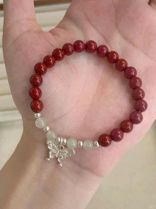
Red — vitality, courage, and emotional warmth.
-
Yellow / Gold — abundance, groundedness, and practical direction.
-
Green — balance, renewal, and creative flow.
Use these as practical signposts when you choose a pendant for a specific mood or function.

Matching color to intention
Calm & Rest — Blue or White
If your goal is stress reduction or steadier emotion (think hectic schedules or sleep challenges), choose blue or white tones. Blue Thangka pigments and turquoise cabochons are excellent visual anchors for breathing work. White or ivory details (mother-of-pearl insets, white enamel) read as quiet and clean.
Ritual: Hold the pendant for 30 seconds and breathe slowly (4-1-6). Repeat before bedtime or a stressful call.

Focus & Clarity — Yellow, Gold, or Deep Green
Need sharper thinking, clearer emails, or cleaner decision-making? Yellow and gold tones prime the mind toward optimism and actionable goals. Deep green is another strong option for sustained concentration and recall, useful for study or negotiation work.
Ritual: Before a deep work block, look at the pendant and name one micro-goal (e.g., “draft one section in 45 minutes”), then start a 25-minute focus block.

Energy & Confidence — Red or Coral
Red and warm coral are attention-grabbing and energizing—good for presentations, interviews, or days when you need more assertiveness. Use red sparingly in professional settings (as a single pendant or a small accent) to keep the look polished.
Ritual: Touch the pendant three times before a presentation, inhale, and speak your key point aloud.

How to pair pendant hues with U.S. business-casual outfits
These simple palettes keep your pendant legible and your look office-appropriate.
Blue / White pendants — Calm wardrobe
-
Outfit: navy blazer, cream silk blouse, charcoal trousers.
-
Why it works: cool tones reinforce the pendant’s calming effect and look cohesive on video.
Yellow / Gold pendants — Focus wardrobe
-
Outfit: camel coat or blazer, white shirt, olive chinos or pencil skirt.
-
Why it works: warm neutrals complement gold accents and read as grounded and professional.
Red / Coral pendants — Energy wardrobe
-
Outfit: charcoal or navy suit with a warm blouse (mauve or blush) or a structured dress in deep neutrals.
-
Why it works: the red pendant pops against neutrals without overwhelming the look.
Green pendants — Creative / hybrid wardrobe
-
Outfit: olive blazer, off-white tee, tailored denim or khaki trousers.
-
Why it works: green pairs well with earth tones and adds a fresh, contemporary feel.
Practical shopping notes: materials, sealing, and scale
-
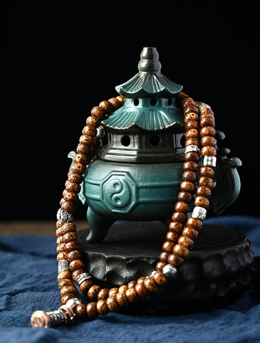
Materials: Mineral pigments and turquoise are classic; natural stones feel tactile and grounding. For workplace wear, choose a protective bezel and a sealed inset if the piece is hand-painted.
-
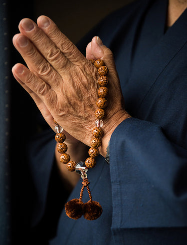
Care: painted miniatures often require gentle care—avoid showering and store in a padded pouch.
FAQ
Q: Does color determine the pendant’s spiritual power?
A: No—color helps frame a personal intention and creates a daily cue for behavior. Treat hue as a practical prompt for mood and focus, not a guaranteed outcome.
Q: Can I mix colors when layering?
A: Yes — but keep one representational piece as the focal color and layer texture-only chains or neutral stones so the meaning stays legible.
Q: Which color is best for gifts?
A: If you’re unsure, choose calming blues or neutral lotus motifs; they read as universally thoughtful and are workplace-friendly.
Choosing a Thangka pendant by color is an elegant shortcut: it turns an aesthetic decision into a practical tool for mood and performance. Whether you want calm, focus, or a boost of energy, lean into the hue that matches your daily intention, pair it with a matching wardrobe palette, and add one short ritual to make the pendant useful—not merely beautiful.

樣本圖片庫